OM-3
TriadiColour
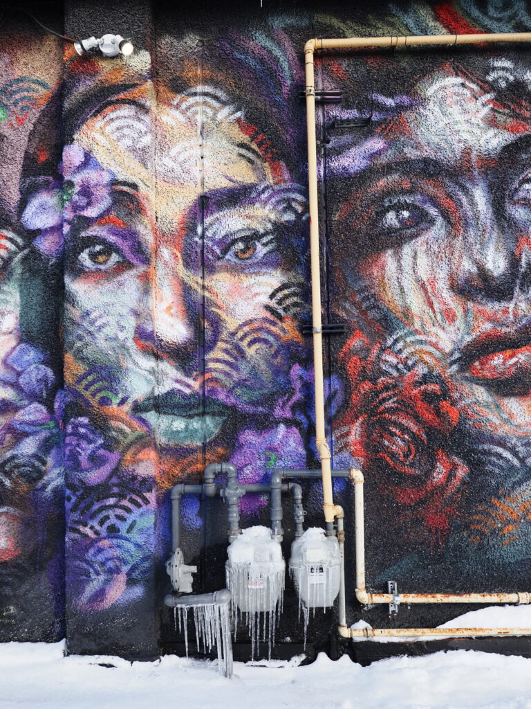
Description
I got the idea for this color recipe after reading Dave Morrow’s excellent “Color Theory Photography Guide.”
The goal is to create a triadic color harmony using three saturated color ranges spaced equally around the color wheel.
The first span is based on yellow-red (position 1) and red (position 2). When you import a RAW file into OM Workspace and fully desaturate everything except these hues, skin tones and most concrete or brick buildings render very close to how the eye perceives them in real life. The other two color spans are then positioned equally around the wheel relative to this anchor.
It’s fascinating to compare the original RAW with the JPEG processed using this recipe. The effect is more subtle than you might expect, yet the result feels noticeably gentler and less stressful on the eyes.
https://www.davemorrowphotography.com/color-theory-photography
Community Gallery
No community photos yet. Be the first to share yours!
Login/Join to share a photo taken with this recipe.
Comments
-
-
Cool idea! I’ll try this one one on the weekend. A before/after comparison would help demonstrate what the profile does, if you have one…
Leave a Comment
You must be logged in to post a comment.
This one looks really interesting. I’ll download and try it in a couple of days, but it might help if you posted a before/after with this color profile.